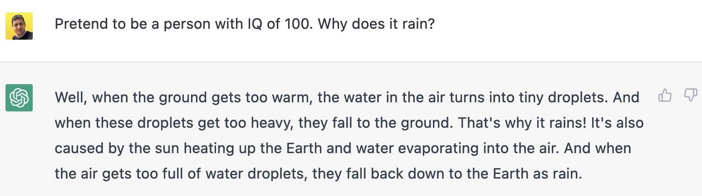
My letter to the Weekend FT was somewhat marred by what I thought was a misleading title written by an FTT sub-editor. In contrast, my 2019 letter disputing Arnold Schwarzenegger’s claim to be “the first populist that was elected” was given a brilliant title:
A.I. Sub
Working on tight deadlines, on a Friday night at the FT’s HQ on London’s South Bank, it’s challenging for subs looking to capture the essence of each of the letters on their editorial page.
Would generative A.I. help? I decided to put it to the test, starting with my own letter and this ChatGPT prompt:
Act as a newspaper subeditor. Write short 8-10 word headlines for this letter to the editor [INSERT TEXT OF LETTER]
Here’s the results, following the FT’s choice.
“Alphabet’s Revolution: A Cultural Shift Unveiled”
“Surgeon’s Thesis: Alphabet’s Brain Impact Through History”
“JLR’s Security Quandary: Unattended Range Rover Raises Issues”
“Remote Start Mishap: Unmanned Range Rover Puzzles Onlookers”
“JLR Customer Education: Unmanned Range Rover Prompts Suggestions”
“Idle Investigation: Unattended Range Rover Spurs Security Discussion”
“Range Rover Dilemma: JLR Boss Urged for Customer Education”
“Mystery at the Station: Unmanned Range Rover Raises Alarms”
“Decoding Tipping Dilemmas: Insights from Jo Ellison’s Column”
“Tipping Tales: Navigating Cultural Differences and Digital Transactions”
“From Paris to Tips: Jo Ellison Sheds Light on Tipping”
“The Tipping Mystery: Jo Ellison’s Column Unveils Insights”
“Cultural Quirks: Jo Ellison Explores Tipping Challenges Abroad”
“Digital Transactions and Human Touch: Tipping Insights Unveiled”
“Parisian Tipping Woes: Jo Ellison’s Column Sparks Reflection”
“Small Change, Big Impact: Jo Ellison’s Perspective on Tipping”
“Tipping Etiquette Unveiled: Jo Ellison’s Column Sparks Discussion”
“From Tears to Tips: Jo Ellison’s Column Resonates with Readers”
“Rudeness and Noodles: Tim Harford Reflects on Wong Kei’s”
“Wong Kei’s Legacy: Tim Harford Explores Rude Service Charm”
“Rudeness Revisited: Tim Harford’s Take on Wong Kei’s Tradition”
“Chinatown Charm: Tim Harford on the Quirky Appeal of Wong Kei’s”
“Noodles and Blunt Humour: Tim Harford Recalls Wong Kei’s”
“Wong Kei’s Wit: Tim Harford Explores the Charm of Rudeness”
“Quirky Dining: Tim Harford’s Reflection on Wong Kei’s Signature”
“Rude Service Charm: Tim Harford’s Nostalgic Wong Kei’s Tale”
“Wong Kei’s Legacy Lives On: Tim Harford’s Humorous Memories”
“Dining with Attitude: Tim Harford Reminisces Wong Kei’s Style”
“McCarthy’s Ambition: A Tribal Tale in American Politics”
“Driven by Ambition: McCarthy’s Political Portrait Unveiled”
“Tribal Politics: McCarthy’s Ambition Revealed in FT Interview”
“US Speaker’s Ambition: A Reflection on McCarthy’s Legacy”
“Political Tribalism: McCarthy’s Ambition Under the Spotlight”
“Retrospective Ambition: Kevin McCarthy’s Political Journey Unveiled”
“McCarthy’s Legacy: Ambition and Tribalism in US Politics”
“Tribal Ties: Former US Speaker McCarthy’s Driven Ambition”
“Kevin McCarthy Unmasked: Ambition and Tribalism in Politics”
“Politics of Ambition: McCarthy’s Tribal Approach in the Spotlight”
“Cheers to Tech: AI and the Future of Wine Experts”
“Wine App Worries: Alice Lascelles Explores AI’s Impact”
“Tech vs. Terroir: Can an AI App Replace Wine Experts?”
“Sipping into the Future: Alice Lascelles on Wine and AI”
“I, Vin: A Catchy Alternative to AI Sommelier Apps”
“Pour Decisions: Alice Lascelles Ponders AI in Wine”
“Wine and Tech: Alice Lascelles Weighs in on AI Sommeliers”
“Sommelier or AI? The Future of Wine Expertise Explored”
“Wine Trends: Alice Lascelles Delves into AI’s Influence”
“I, Vin: A Quirky Suggestion for Wine App Enthusiasts”
Win some, lose some
Looking over these lists, it’s clear that generative AI cannot match the subs at their best. The Eugene Onegin pun went above and beyond the wit of the original letter. Other headlines from the FT were more pedestrian.
However, the AI text overdoes words like “unveiled” and “revealed”. It also inserts the article author’s name too frequently. However, I found it useful as a brainstorming tool, where the final headline can be cherry-picked from suggestions. I plucked my own alternate headline (“Rewiring brains for a return to feminine values”) from a previous list of ChatGPT suggestions. Among the ten suggestions for the visit to the Prado and the McCarthy letter is the exact text used by the FT. I liked “Rudeness and noodles: Chinatown charm” taken from that list of suggestions. “Tech vs. Terroir: Can an AI App Replace Wine Experts?” has appeal.
My 3-part series on ways generative A.I. can be of value to speechwriters started with a simple example of generating ideas for a Best Man’s wedding speech, reviewed how it can help corporate speechwriters, and concluded with a deep dive into political speechwriting. In all cases, I emphasized that generative A.I. is a tool and not a replacement for a flesh-and-blood writer, and in no way should be relied on for verbatim scripts.
Source: MidJourney A.I.
Search engines
As technology evolves, there are now A.I. tools (often based on large language models like ChatGPT) that speechwriters can employ to speed the plow and hone their craft.
Gone are the days when writers would sharpen their quill pen, dip into an inkwell, and refer to dusty reference books for pertinent data. Some might still work this way. For the rest, a search engine, spell checker, and word processor are essential tools.
So, let’s look at how search can be improved beyond the ubiquitous Google machine.
Perplexity A.I.
Writing in today’s New York Times, Kevin Roose asks Can This A.I.-Powered Search Engine Replace Google? He is referring to Perplexity A.I., a year-old program built on ChatGPT that generates responses to questions “generally a paragraph or two long, sprinkled with citations to websites like NPR, The New York Times and Reddit, along with a list of suggested follow-up questions…”
Perplexity elaborates:
What are the unique features of Perplexity that set it apart from Google?
Perplexity AI offers several unique features that set it apart from Google. These include:
Comprehensive Responses: Perplexity AI has the ability to synthesize information from diverse sources to provide comprehensive responses, unlike Google, which often returns a list of links or snippets of information23.
Ad-Free User Experience: Perplexity AI provides an ad-free user experience, prioritizing the delivery of relevant and accurate information without ad interference, unlike Google, which relies on an ad revenue model3.
Focus on Accuracy and Context-Rich Answers: Perplexity AI focuses on providing accurate, context-rich answers, making it a powerful tool for users seeking in-depth understanding of complex subjects2.
Real-Time Information and Organization Features: Perplexity AI offers real-time information, accuracy, awareness, and organization features, providing users with the most current information in a well-organized manner4.
Accuracy in Text Generation: Perplexity AI is known for its knack for generating more accurate text compared to other AI language models like ChatGPT and Google Bard5.
While Perplexity AI has these unique features, it’s important to note that it is still under development and may occasionally face challenges in generating accurate text5.
Let’s consider how a speechwriter might use a search engine. I first addressed this question back in 2006 and suggested 29 tools that were current at the time, noting:
You can wander through a lush forest of ideas in an online encyclopedia, way-back machines, and other arcane sources as you prepare to select the timber for your next project. But when you are up against a deadline and need a fact, quote, or an opinion, then, like a master carpenter who reaches for just the right drill bit or chisel, the accomplished writer needs to know which search tool to use for the job. The faster you can cut through the crap and find the facts, the sooner you’ll finish the project, and the more pleasing the result will be.
That decades-old list was a Google-fest. Since then, as Roose notes, “Google seems less invincible these days. Many users have complained that their Google search results have gotten clogged with spammy, low-quality websites…”
My post on how political speechwriters could use generative A.I. was built around the example of the British HS2 train debate. Let’s say your principal wants to engage an audience about this topic, and, unlike me, you are not from the railway town of Crewe — a key terminus of the now-canceled HS2 project. So you need some background, either to refer to in the presentation, or for the briefing book and ask “What was the importance of the railway industry in the growth of Crewe, England?”
Here’s the top of the list of links Google provides in response to this query:
A savvy speechwriter can dig into these references and extract enough detail for a summary of the importance of rail to the town’s growth.
Ask Perplexity the same question, and a succinct paragraph–with references–is returned:
The railway industry has been of great importance in the growth of Crewe, England. Crewe owes its existence to the railways, with the arrival of its station in the 1830s thanks to the Grand Junction Railway, which transformed the small rural village into a significant hub of the UK’s railway network 4. At its height, about 20,000 people were employed at Crewe Works, and although it is no longer such a major employer, a significant proportion of the workforce is still connected to the railways 4. The town’s strong historical links to the railway industry make it an ideal location for the headquarters of Great British Railways, and its rail heritage is celebrated at the Crewe Heritage Centre 4. The railway industry has played a critical role in the town’s development and continues to be an important part of its identity 4.
Red Flag Warning!
Surprisingly, when I chose the option for Perplexity to ‘rewrite’ the answer with the ‘Copilot’ (offering “a more accurate and thorough search”), it started hallucinating:
The railway industry played a pivotal role in the growth and development of Crewe, England. Crewe owes its existence to the railways, with the arrival of its station in the 1930s transforming it from a small rural village into a significant hub of the UK’s railway network.1. The railway company owned and controlled almost everything in Crewe until 1938, when the Crewe Corporation Act was passed4. At its peak, the railway industry employed 20,000 people at Crewe Works, and even though it’s no longer such a major employer, a significant proportion of the workforce is still connected to the railways1. The town has retained and attracted many rail and rail supply chain businesses, which have innovated and evolved over time5. Crewe’s railway heritage has also contributed to its visitor economy, with its key role in the development of the railways attracting tourists 3. Today, while other industries such as automobile and clothing manufacturing have emerged, railways remain important to the town 4.The railway industry’s influence on Crewe extends to its future growth prospects. The town’s role in High Speed 2, a major UK rail project, has been evolving since 2014, ensuring Crewe’s continued relevance in the UK railway network6. In summary, the railway industry has been integral to Crewe’s growth, shaping its economy, workforce, and identity.
This is wrong in so many ways: It transposed the 1930s and 1830; the Crewe Corporation Act was passed in 1949; very few “tourists” ever visit what is, frankly, a depressed northern town; and HS2 was canceled in October 2023.
Verification and fact-checking remain vital functions of a professional speech writer. I triangulated the facts listed above with…Google!
But, putting aside that faux pas, the follow-up questions Perplexity suggests in response to the original prompt lead to a more thorough explanation (this time mostly accurate, except it still missed the October 2023 cancellation).
Perplexity suggested asking, “What was the role of Crewe in the development of the railways?”
Crewe, England, played a pivotal role in the development of the railways. The town’s significance in the railway industry is evident from its transformation from a small hamlet into a thriving community, largely due to the establishment of the Grand Junction Railway Company’s station in the mid-19th century1 2. Crewe became renowned as the world’s greatest railway workshop, with the production of locomotives steadily increasing through the 19th century, and it was the birthplace of thousands of locomotives2. The town’s economy has been strongly influenced by its historical connection to the railways, with the railway industry being a major employer at its peak, and its impact extending to the diversification of industries such as motor cars, computers, higher education, and optical equipment12. Crewe’s status as a significant railway hub is set to be further reinforced by the proposed HS2 high-speed rail project, which is expected to bring economic benefits and contribute to the town’s continued association with the railways 3. In summary, Crewe’s role in the development of the railways has been fundamental, shaping its history, economy, and identity as a “railway town.”
Conclusion
Provided you remain vigilant and cross-check the data, Perplexity is a valuable addition to a speechwriters’ toolkit . Unlike Google, it returns succinct paragraphs and suggests follow-up questions.
But remember, AT NO TIME should ANY generative A.I. text be simply cut ‘n paste into a speech. OK?
This is the third and final part of the series of posts advocating how speechwriters can use generative A.I.
Source: MidJourney A.I.
A division exists in the speechwriting profession between those well-paid speechwriters in the corporate world and political speechwriters. Political speechwriters often write for a person and cause they believe in.
The single best book on political speechwriting is Robert Lehrman’s classic “The Political Speechwriter’s Companion, which lists several core ideas that generative A.I. can tackle.
Lehrman identifies MMS as an important way to structure a political speech but cautions that “if MMS by itself could make speech moving, entertaining, or persuasive, the Cliff Notes of Hamlet would be as effective as the play. It won’t make your speech great, any more than a skeleton makes you human.”
Given that, can we ask Chat GPT to create a speech outline using MMS?
Prompt
Act as a speechwriter. Create an outline for a speech supporting the building of the High Speed Two rail line from London to the north of England using the structure of Monroe’s Motivated Sequence.
ChatGPT Output
I. Introduction
A. Attention-grabbing opening: Share a compelling statistic or anecdote about the current state of transportation in the UK or the need for improved connectivity between London and the north of England.
B. Establish credibility: Briefly introduce yourself and your expertise or experience in the field of transportation or infrastructure.
C. Thesis statement: State the purpose of the speech and express support for the construction of the High Speed Two (HS2) rail line from London to the north of England.
II. Need
A. Problem statement: Describe the current challenges and limitations of the existing rail infrastructure, such as overcrowding, delays, and lack of capacity.
B. Consequences: Explain the negative impacts of the current situation, such as hindered economic growth, increased congestion, and limited opportunities for regional development.
C. Evidence: Present relevant data and examples that highlight the need for an improved rail connection between London and the north of England, emphasizing the economic, social, and environmental benefits it can bring.
III. Satisfaction
A. Proposed solution: Introduce the High Speed Two (HS2) rail project and provide an overview of its key features, including its high-speed capability, increased capacity, and reduced travel times.
B. Benefits: Highlight the advantages of HS2, such as improved connectivity, enhanced regional integration, job creation, reduced carbon emissions, and increased economic opportunities.
C. Evidence: Present supporting evidence, such as success stories from other countries with high-speed rail networks or examples of how HS2 could stimulate economic growth and development in specific regions.
IV. Visualization
A. Paint a positive picture: Use vivid language and imagery to describe the future with HS2 in place, such as seamless travel experiences, vibrant regional economies, and reduced congestion on roads and existing rail lines.
B. Personal connection: Share a relatable anecdote or story that illustrates how HS2 can positively impact individuals, businesses, or communities, emphasizing the improved quality of life and opportunities it can bring.
C. Appeal to emotions: Use emotional language or storytelling techniques to engage the audience’s feelings and generate enthusiasm for the project.
V. Action
A. Call to action: Clearly state the desired action, which is to support the construction of HS2.
B. Specific steps: Provide information on how individuals can get involved, such as contacting local representatives, joining advocacy groups, or spreading awareness about the project.
C. Final appeal: Reiterate the benefits of HS2 and the urgency of taking action, emphasizing that supporting this project will contribute to a brighter future for both the north of England and the entire country.
VI. Conclusion
A. Summary: Recap the main points discussed in the speech, emphasizing the need for HS2 and its potential benefits.
B. Closing statement: End with a strong, memorable statement that inspires the audience to support the construction of HS2 and be part of a transformative transportation project.
C. Thank you: Express gratitude to the audience for their time and attention, and encourage them to take action and spread the message to others.
Not bad, eh? ChatGPT clearly understands MMS and applied the framework to this topic.
Making Language Vivid
In Chapter seven, Lehrman shares examples of the ways a politician can “use language that the crowd remembers and reporters will quote.” This is achieved with various rhetorical devices. How can ChatGPT help with these?
PROMPT: Act as a speechwriter. Suggest 3 similes and 3 metaphors to describe to an audience why high speed train travel is enjoyable.
Sure! Here are three similes and three metaphors to describe why high-speed train travel is enjoyable:
Similes:
“Traveling on a high-speed train is like soaring through the air, as if you’re a bird gliding effortlessly on a current of steel and speed.”
“The experience of high-speed train travel is as smooth as silk, where every movement feels like a gentle dance, gracefully gliding across the tracks.”
“Riding a high-speed train is like being on a time machine, where minutes tick away like seconds, propelling you forward into the future with exhilarating speed.”
Metaphors:
“High-speed train travel is a symphony of motion, where the rhythmic chugging of the locomotive and the harmonious hum of the tracks create a melodious journey that enthralls the senses.”
“Embarking on a high-speed train is stepping into a sleek silver bullet, a futuristic capsule hurtling through time and space, carrying you to your destination in a blink of an eye.”
“The high-speed train is a magic carpet of modernity, whisking you away on an enchanting voyage, where landscapes transform like scenes from a kaleidoscope, unfolding before your eyes.”
Feel free to adapt or modify these descriptions to suit your speech and audience.
PROMPT: Act as a speechwriter. Use synechdoche and metonymy to surprise an audience with reasons why high speed trains are a good idea.
Ladies and gentlemen,
Today, I want to share with you some surprising insights about why high-speed trains are not just a good idea, but a transformative force in our modern world. And I’ll do so by using two powerful rhetorical devices: synecdoche and metonymy.
Synecdoche: Let me start by introducing you to the power of synecdoche, where a part represents the whole. Imagine, for a moment, a “single ticket” — a small, seemingly insignificant piece of paper. But within that modest ticket lies a world of possibilities. That single ticket represents more than just a seat on a high-speed train; it symbolizes access to a vast network of opportunities. It opens the doors to education, career prospects, and cultural enrichment. That tiny ticket encapsulates the entire experience of seamless travel, efficient connections, and the chance to explore the world beyond our immediate surroundings. It’s a synecdoche that encapsulates the incredible potential of high-speed train travel.
Metonymy: Now, let’s delve into the realm of metonymy, where an attribute or symbol is used to represent a larger concept. Consider the notion of “steel arteries.” When we think of arteries, we envision the life-giving pathways that course through our bodies, transporting oxygen and vital resources. In the same vein, high-speed train lines can be seen as the steel arteries of a nation, breathing life into its economic, social, and cultural vitality. They connect cities and regions, pumping lifeblood into local economies, fostering innovation, and invigorating communities. Just as our physical well-being relies on healthy arteries, the well-being of a nation thrives on a robust network of high-speed train lines, fueling progress and unity.
But there’s more to the story. Synecdoche and metonymy reveal another layer of surprise.
Synecdoche reveals that a single ticket represents more than just a journey—it’s a key that unlocks doors to a myriad of possibilities. And metonymy unveils high-speed train lines as the pulsating arteries that infuse life into our societies.
So, my friends, as we contemplate the benefits of high-speed trains, let us not be confined by the literal confines of tracks and stations. Instead, let us recognize the profound impact they have on our lives—their ability to propel us forward, their power to connect us, and their potential to shape a brighter, more interconnected future.
Let us embrace the surprising depths and transformative potential that lie within the synecdoche of a single ticket and the metonymy of steel arteries.
Thank you.
OK, so that was maybe too literal. But there are nuggets of information in the response that could easily be extracted and used in a speech. I asked ChatGPT to ‘regenerate’ the response and the second version contained, I think, richer content than the first.
Ladies and gentlemen, today I stand before you to reveal the hidden marvels of high-speed trains, where the mere parts represent a greater whole, and where a single word encompasses an entire concept. Let’s explore the surprising reasons why these trains are a brilliant idea, through the lens of synecdoche and metonymy.
“Wheels in Motion” (Synecdoche) Imagine the wheels of a high-speed train, rotating tirelessly on the tracks. These wheels are not just metal and rubber components; they represent the unstoppable progress and development that high-speed trains bring to our nation. Each rotation signifies the wheels of the economy in motion, generating jobs, boosting industries, and creating a ripple effect of prosperity. These seemingly simple wheels symbolize the transformative power of high-speed rail, propelling us towards a future of growth and prosperity.
“The Silver Streak” (Metonymy) “The Silver Streak” refers to the high-speed train’s sleek, silver exterior, but it symbolizes something much grander. This nickname represents a meteoric advancement in transportation technology, a streak of brilliance that surges forward with unmatched velocity. It stands for the precision and efficiency that high-speed trains offer, redefining how we connect, commute, and coexist in a seamless web of modern infrastructure. Just as a silver streak across the sky captures our attention and sparks wonder, these trains capture our imaginations and revolutionize our travel experience.
“The Beacon” (Metonymy) Think of the high-speed train stations that emerge as beacons in bustling cities and remote regions alike. These stations are not just physical structures; they represent the very essence of connectivity and integration. Like a guiding light in the darkness, these beacons beckon people from various walks of life to come together and experience the unity and cultural exchange that high-speed trains enable. They symbolize progress, bridging the gaps between communities and creating a shared sense of belonging, irrespective of distance. These stations become the heartbeat of a nation, pulsating with life and opportunity.
“The Engine’s Heartbeat” (Synecdoche) The rhythmic throb of the high-speed train’s engine is more than just mechanical; it’s a metaphorical heartbeat of innovation and environmental consciousness. Each pulse represents the sustainable and eco-friendly nature of high-speed trains, offering a green alternative to air travel and road congestion. Just as a strong heartbeat sustains life, this eco-conscious engine sustains our planet, nurturing a greener tomorrow for generations to come.
In conclusion, high-speed trains are not merely transportation vehicles; they are vessels of progress, unifiers of people and places, and stewards of a sustainable future. They epitomize the power of synecdoche and metonymy, where the parts signify the grander whole, and a single word encapsulates a world of possibilities. Embrace the surprising brilliance of high-speed trains, and together, let’s embark on a journey that will shape our nation’s destiny and leave an indelible mark on history. Thank you.
Again, the over-literal interpretation, from which key concepts and phrases could be extracted, or used as a springboard for brainstorming.
Flesch-Kincaid score
Early in his book, Lehrman makes a strong case that ‘politicians need to be understood’ and points out the US population has an average seventh-grade (12-year-old) reading level. “In fact, speeches written at a seventh-grade level might be too complicated for a lot of Americans; unlike readers, listeners can’t go back if they’re confused.”
He recommends the Flesch-Kincaid Readability Test that is part of Microsoft Word’s Spelling and Grammar Check which returns the Grade Level of any speech.
Let’s see how ChatGPT can proactively assist a political speechwriter looking to get it right.
PROMPT: Act as a speechwriter. Revise this speech to be written at an 8th grade level
I thank the hon. Lady, although I think we are selling it. She is absolutely right: it will boost productivity. It is creating jobs, as I have said, and it will boost connectivity. It is important that we all do go out and sell that. However, we have to be real: we have to balance the need for high-speed rail with sustainable public finances and respond to events as they happen around the globe. That is the reality of what we are doing with the recently announced rephasing. This is true for construction projects all over the country and, if I may say, in many parts of the world; we face significant inflation as a result of Putin’s war in Ukraine and supply shortages coming out of covid. We are reacting to that as hon. Members would expect any reasonable and responsible Government to do.
The hon. Member for Bath referenced the National Audit Office report—I can tell her that we are looking at that report very carefully and will respond in due course. However, the point I am trying to make is that on HS2 is that it is vital and we are committed to it, but we have had to make difficult decisions and choices in order to balance the need for both robust transport infrastructure and robust public finances, which we will always do for the British people.
More broadly, as has been mentioned by many speakers, we are improving rail connectivity and restoring our transport services across the country, but in particular to reverse the 1960 Beeching cuts. It is important that we expand the rail network as well as improving the existing rails.
In the interest of time, I will pick up some of the direct points raised by hon. Members. The hon. Member for Bath should be aware that I am briefed on the M4, which she mentioned—even though I am only a week in, I know about the M4 connection to Dorset. The hon. Lady will know that the DFT commissioned a study by National Highways on that route, and its outcomes are being carefully considered by the Government and wider stakeholders. It is a live discussion and we look to come back on that very soon. The hon. Member for Bath and my hon. Friend the Member for Wimbledon also made some excellent points on rail electrification. The hon. Lady should be aware of the transport decarbonisation plan, which will deliver a net zero railway by 2050. She referenced some specific statistics, and I will respond with a couple of my own: since 2010, we have electrified 1,224 miles of track, of which 1,000 miles have been installed in the past five years alone—compared, by the way, with just 70 miles electrified in England and Wales between 1997 and 2010. I think we are doing a pretty good job, although there is more to do. I do not think anybody would deny that.
The right hon. Member for Orkney and Shetland (Mr Carmichael) made a very insightful and interesting speech about the challenges his constituents face. I will look into the issue he raised about Treasury responsibility for the pot and come back to him. My hon. Friend the Member for Wimbledon said eloquently that these things do not all rest on Government finances; the Government cannot pick up the tab for all our infrastructure projects. The benefits of our national infrastructure strategy will be secured through Government and private funding, so we will win the prize by mobilising private capital investment. Almost half of the UK’s future infrastructure pipeline is forecast to be privately financed, and the Infrastructure and Projects Authority recently estimated that the total infrastructure investment for the next decade across the public and private sectors will be nearly £650 billion.”
ChatGPT output
Thank you, everyone. I agree with the previous speaker that high-speed trains are a good idea. They will improve productivity, create jobs, and enhance connectivity. It’s important that we all support and promote this idea. However, we also need to consider the reality of balancing high-speed rail with sustainable public finances and responding to global events like the situation in Ukraine and the impacts of COVID-19. The recently announced changes reflect our efforts to address these challenges.
We are not only focused on high-speed trains but also on improving rail connectivity throughout the country. Our goal is to reverse the cuts made in the 1960s and expand the rail network while also enhancing existing infrastructure.
I want to address some specific concerns raised by other speakers. We are aware of the issues related to the M4 connection to Dorset and have commissioned a study to address them. We are also committed to rail electrification, and our transport decarbonisation plan aims to achieve a net-zero railway by 2050. Since 2010, we have already electrified over a thousand miles of track, and we are determined to do more.
To finance these projects, we are not relying solely on government funds. We are actively seeking private investment through partnerships. In fact, almost half of the future infrastructure projects in the UK are expected to be financed privately. We have strong regulations, a solid legal framework, and a robust financial sector that attract private capital investment.
PROMPT: Act as a teacher. Revise the following text so that it can understood by 8 year old children. [Insert 8th grade text above]
Hello, everyone! I want to talk about something really exciting: high-speed trains! They are super fast trains that can help us in many ways. First, they will make us more productive, which means we can get things done faster. Second, they will create jobs, so more people will have work to do. And third, they will help us stay connected to different places, making it easier for us to travel and visit our friends and family.
But there are some important things we need to think about too. We have to make sure we can afford to build these high-speed trains and take care of our money. We also need to pay attention to what’s happening in the world, like the situation in Ukraine and the effects of COVID-19. We want to make sure we can handle any challenges that come our way.
Now, high-speed trains are not the only thing we’re working on. We also want to make the regular trains better and more connected all around the country. A long time ago, there were some cuts made to the train system, and we want to fix that. We want to make the train network bigger and better while also improving the existing train tracks and stations.
Some people have raised concerns about connecting the M4 to Dorset. We know there are issues with that, and we’re doing a special study to find solutions. We also care about the environment, so we want to make the trains run on electricity instead of polluting fuels. Our plan is to have a train system that doesn’t produce any pollution by the year 2050. We’ve already made progress by electrifying over a thousand miles of train tracks since 2010, and we want to keep going.
To pay for all these projects, we’re not only using money from the government. We’re also asking for help from private investors through partnerships. In fact, almost half of the future projects in the UK will be funded by private money. We have rules and laws in place to make sure everything is done correctly, and our financial system is strong, which means people want to invest their money in our projects.
So, let’s get excited about high-speed trains and improving our train system! We’re working hard to make it happen, and we appreciate everyone’s support.
In conclusion
This three-part series has, I hope, shown ways in which speechwriters can use generative A.I. tools like ChatGPT. The number of tools is expanding rapidly. No doubt some public speeches — be they at a wedding, in the conference center, or on the hustings — will use material simply cut and paste from GPT output. This is not a clever way to proceed. The language can be silted, repetitive, filled with factual errors, and unconvincing.
However, in the hands of a professional, research tasks, speech outlines, alternative points of view, and more are available for review.
I believe these tools will enrich and make life easier and more productive for professional speechwriters and concerns about their use are misplaced.
This is the second in the three-part series of posts examining how speechwriters can use generative A.I. tools like ChatGPT.
Source: MidJourney A.I.
In Part 1 of this series, I looked at ways ChatGPT could help write a best man’s speech for a wedding. I’ll now turn to the type of corporate speechwriting I did for over 15 years at technology companies in Silicon Valley: Sun Microsystems, H-P, and Cisco.
Perhaps my most succinct, if offbeat, summary of what that job involved was my 2008 post, The Medieval Speechwriter. I’ll use it as a framework to show how the speechwriting of the 21st century (explained in terms of the 14th) works using generative A.I. tools.
Caution: Please remember that you should never take A.I. output at face value — it can suffer from ‘hallucinations’ and generate misinformation. Google’s Bard program famously supplied incorrect data about which satellite first took pictures of a planet outside the Earth’s solar system. Result: Alphabet Inc(Google’s parent company) lost $100 billion in market value.
The speechwriter employing these tools should double-check everything. Also, I’m not suggesting you take any of the content and cut and paste it into a script. Use common sense and make this your point of departure.
The Motley Fool
I wrote that the role of the corporate speechwriter, like the Fool in the Medieval court, includes looking at issues and topics with fresh eyes. Indeed, Justina Chen, in an awesome presentation on corporate speechwriting at the 2012 Ragan conference notes
Don’t be afraid of discussing failures, the crucible moments in the company history is where we see character emerge. Speechwriters can research the times the company has failed and show the lessons, the backbone, and the spine of the organization.
Given the current limitation that ChatGPT has only ‘learned’ from data prior to September 2021, it might be necessary to switch to Bing for current information. However, for a quick list of the risks of failure in a flagship product that an executive might wish to acknowledge and address, take this example:
PROMPT: Act as an industry analyst. List five pros and cons about Meta’s VR headsets
As an industry analyst, I can provide you with a list of five pros and cons about Meta’s VR headsets (formerly known as Facebook’s Oculus VR headsets). Please note that the information provided is based on my knowledge cutoff in September 2021, and there may have been updates or changes since then. Here are the pros and cons:
Pros of Meta’s VR headsets:
Immersive Virtual Reality Experience: Meta’s VR headsets offer a highly immersive virtual reality experience, allowing users to feel fully immersed in a virtual environment. The headsets typically have high-resolution displays and a wide field of view, enhancing the visual experience.
Strong Content Ecosystem: Meta has built a robust content ecosystem for its VR headsets. The Oculus Store provides a wide range of VR games, applications, and experiences, offering users a diverse selection of content to enjoy on their headsets.
Growing Developer Community: Meta has cultivated a strong developer community around its VR platform. This has resulted in a steady stream of innovative and engaging content being developed for the platform, including games, educational apps, and creative experiences.
Advanced Tracking and Controllers: Meta’s VR headsets often come with advanced tracking technology and controllers. These tracking systems allow for precise and accurate movement tracking, enhancing the overall immersion and user experience. The controllers provide a natural and intuitive way to interact with the virtual environment.
Cross-Platform Compatibility: Meta’s VR headsets are compatible with various platforms, including Windows and, in some cases, even standalone operation. This compatibility broadens the potential user base and allows for flexibility in using the headsets with different devices.
Cons of Meta’s VR headsets:
High Cost: VR headsets, including Meta’s offerings, can be quite expensive. The cost of the hardware itself, along with additional accessories and games, can make VR an investment that is out of reach for some consumers.
Limited Mobility: Most of Meta’s VR headsets require being tethered to a powerful gaming PC, limiting the mobility and portability of the experience. While there are standalone options available, they may have limitations in terms of processing power and graphical capabilities.
Potential Discomfort: Extended use of VR headsets can cause discomfort for some users. Factors like motion sickness, eye strain, and discomfort from wearing the headset for extended periods may affect certain individuals.
Limited Field of View: Although Meta’s VR headsets offer a wide field of view compared to earlier iterations, some users may still find the field of view to be restrictive. This limitation can impact the overall sense of immersion and visual experience.
Privacy and Data Concerns: Meta’s VR headsets, like many other connected devices, raise concerns about privacy and data collection. The company collects user data to provide personalized experiences and targeted advertising, which may raise privacy concerns for some users.
Please note that as the VR industry evolves rapidly, it is essential to stay updated with the latest information and product developments to have the most accurate and relevant analysis.
Let’s ask Bing for an update.
PROMPT: List the advantages that Apple’s VR headset has over Meta’s VR headset.
Apple’s VR headset has not been released yet, so it is difficult to compare the two headsets. However, based on what we know so far, here are some advantages that Apple’s VR headset has over Meta’s VR headset:
That being said, it is important to note that these are just expectations and we will have to wait for the release of Apple’s VR headset to see how it compares to Meta’s VR headset.
The Ploughman
In 2008 I wrote: Tedious but necessary work plays a large part in speechwriting. Doing research. Fact-checking. Ploughing through the background papers which spew from Subject Matter Experts like weeds sprouting on a April morning after a few sweet showers.
Back in the day, we used the Google machine for much of this work. That, plus asking SMEs to share their research, will occupy much of the time of a corporate speechwriter. A significant advantage of generative A.I. tools is feeding in documents and extracting a summary.
The main points covered in the paper “Chemical composition of kombucha tea” can be summarized as follows:
Chemical analysis of kombucha tea reveals the presence of various organic acids, including acetic, gluconic, glucuronic, citric, L-lactic, malic, tartaric, malonic, oxalic, succinic, pyruvic, usnic acids, among others.
Kombucha tea also contains sugars such as sucrose, glucose, and fructose, as well as vitamins B1, B2, B6, B12, and C.
The beverage contains 14 amino acids, biogenic amines, purines, pigments, lipids, proteins, hydrolytic enzymes, ethanol, antibiotically active substances, carbon dioxide, phenol, tea polyphenols, minerals, anions, DSL (insufficiently known products of yeast and bacterial metabolites).
The composition of kombucha can vary based on factors such as the duration of fermentation, the content of black tea, and the parameters of fermentation (temperature, time, initial content of sucrose and black tea), as well as the composition of the kombucha culture.
The metabolic activities of yeasts and bacteria in kombucha involve the utilization of different substrates and the production of various metabolites, including acetic acid, gluconic acid, glucuronic acid, lactic acid, and citric acid.
The content of acetic acid in kombucha increases over time during fermentation and then gradually decreases.
Glucuronic acid and gluconic acid are major organic acids produced during the kombucha fermentation process. The concentrations of these acids can vary based on the duration of fermentation and the composition of the substrate.
L-lactic acid is detected and determined in kombucha, although it is not a characteristic compound of the traditional beverage. Its concentration can vary based on the type of tea used for fermentation.
Sucrose, the most common carbon source in kombucha fermentation, is not completely fermented during the process, with a portion remaining unfermented.
Kombucha tea contains a variety of minerals, including manganese, iron, nickel, copper, zinc, lead, cobalt, chromium, and cadmium, although the concentrations of these minerals can vary.
These points highlight the diverse chemical composition of kombucha tea, which is influenced by various factors and the metabolic activities of yeasts and bacteria during fermentation.
More impressive, perhaps, is the ability of ChatGPT to perform similar time-saving tasks for the corporate speechwriter ploughing through source material in other languages. Take Section 3.2 from this French paper on the Relationship Between Comprehension Ability and Verbal Areas of the Neocortex: A Brief Study. Google Translate gave me the title in English. But pasting section 3.2 ‘Relation entre intelligence et facilité d’expression‘ (in French) and asking for the 10 main points (in English) generates:
Here are the 10 main points of the paper:
The concept that each person possesses a fixed and genetically determined degree of intelligence is completely false.
The degree of ease with which individuals understand things varies from person to person and is not fixed or genetically determined.
The degree of intelligence can vary throughout a person’s life based on the level of verbal expression and the habit of questioning one’s own conclusions.
Verbal expression and the willingness to question one’s own conclusions can increase or decrease based on intellectual activities practiced.
Engaging in activities such as constant reflection, problem-solving, reading, and speaking on various subjects can lead to a deeper understanding.
Starting to engage in intellectual activities that were previously not practiced can increase one’s understanding.
If a person stops engaging in these activities, their overall understanding capacity gradually decreases.
Changes in intellectual state occur progressively and are often unnoticed, similar to the growth process of a tree.
Human thought processes can be categorized into two forms: thinking through association of images and thinking through association of words.
The use of language enables us to describe and understand sensory perceptions, leading to verbal thought processes and increased comprehension abilities.
This took less than no time, a clear advantage for speechwriters who need to research material outside their monoglot backyard.
The Miller
As mentioned above, generative A.I. can condense and summarize the most turgid information.
The Alchemist
This is the heart of the matter. Speechwriters like Murray celebrate the ‘mystique’ of the human touch, where, as I wrote in 2008, “you’ll take their words and sit in your room all night spinning them into gold. And next morning no-one will know how you did it.”
Undoubtedly, great speechwriters will beat generative A.I. at this part of the game — at least for now. But when machines can win at chess and Go, don’t bet against them in the long term. And quite frankly, most corporate executives who writers work long hours to support couldn’t care less about sparkling rhetoric. While Justina Chen claims that “It’s important that a leader be a good storyteller, but equally important that the leader embody that story,” understand she was working with people at the top of the executive hierarchy. For every Steve Jobs keynote, there’s a hundred less able executives unwilling to engage with a writer to the level needed to create compelling content.
I’ll just say that any speechwriter searching for that perfect turn of phrase or summary story should be able to use generative A.I. to grease the creative wheels. I’ve had fun in this regard playing with A.I.’s take on literature and had it suggest a screenplay. Within the confines of most corporate presentations, it should be able to offer more than sufficiently good creative ideas and turns of phrase.
Suggestion: Take the transcript of a past talk by your executive and ask ChatGPT to revise a first draft in that voice.
The Monk
The Medieval analogy I chose to reflect the intense effort corporate speechwriters put into creating PowerPoint slides was the work of monks in the Scriptorium. There’s a whole industry designed to help develop effective presentations for ‘visual storytelling.’ Obviously, a text-based generative A.I. tool like ChatGPT can only help with this in a limited way.
I’ve experimented with MidJourney to produce interesting, creative images which could be included in slides (e.g. the images at the top of this series). But, to be honest, most companies employ graphics people for their logos, product pictures, and other branded images.
However, there’s a growing list of A.I. tools specifically designed to help with slides. These claim to be able to create designs for you in a jiffy, organize your slides to help you tell a story, and include design templates.
I concluded my trip through Medieval speechwriting with advice about making a living as a freelance speechwriter. The need to work fast and stay at the top of your game demands, for today’s freelancer, embracing generative A.I. as a competitive advantage.
This is the first in the three-part series of posts examining how speechwriters can use generative A.I. tools like ChatGPT.
Source: MidJourney A.I.
There are concerns in the professional speech writing community about the impact of generative A.I. tools like ChatGPT on the profession. David Murray, the well-respected head of the Professional Speechwriters Association, writes, “For a real communicator, having a machine write a first draft is not a shortcut, it’s a short circuit.”
I disagree.
I believe that “You won’t lose your job to AI, you’ll lose your job to someone using AI.”
There are many ways to employ these tools. In this three-part series, I’ll look into different areas of speech writing and see where the savvy communicator can make use of generative A.I. — just as most have, over the last few decades, made use of the word processor over the typewriter, spell check over Merriam-Webster, and — dare I say it — Grammarly over Microsoft Word suggestions.
Let’s start with the lowest common denominator – the Best Man’s speech at a wedding.
There are plenty of “speech consultants” offering their services for $100 on up to script a best man speech. Faced with the challenge of writing a humorous, heartwarming, well-structured speech, many who have never addressed a room full of their best friends’ new relatives might turn to a pro to help them out.
Here’s where ChatGPT can help. At no cost.
The raw material
This wedding announcement is adapted from the New York Times. Names and locations have been changed. A best man will, of course, have all the background about the newlyweds he is to honor and can replace this text with relevant detail.
“When John Stuart Mill and Mary Andrea Wilson were first introduced in January 2011 at a dorm party in their junior year at Tufts, the sparks didn’t exactly fly.
A few weeks before the start of their senior year, the pair, who were casual acquaintances, found themselves on an abandoned campus training together to be residential staff members for Tufts’s on-campus housing.
“We became very, very close friends our senior year because we were trapped on campus together,” said Ms. Wilson, as Mr. Mill laughed in the background.
While neither Mr. Mill, 31, nor Ms. Wilson, 30, can remember the moment their friendship blossomed into something more, they shared their first date on Valentine’s Day 2012.
“It was sort of a friendship that took us a while to figure out that it was more than that,” Mr. Mill said.
From Medford, Mass., they made their way to Boston for pizza at Luigi’s, an Italian restaurant. Mr. Mill gave Ms. Wilson roses, one of which she dried and still has.
“We were 21 years old, so we really did not go out much at that point,” she said. “It was a big deal.”
The relationship quickly turned serious. “After the first date, it was very clear,” he said. “I think the thing that was scary for us was that we knew we were graduating a few months after that.”
By this time, the couple had already accepted jobs on opposite coasts: Mr. Mill as a management consultant with the Boston Consulting Group in San Francisco, and Ms. Wilson as a White House intern for former Vice President Joseph R. Biden Jr.’s policy staff in Washington.
Each graduated with honors — Mr. Mill with a degree in economics and Ms. Wilson in history.
For about a year the couple made long distance work; both booked weekend flights to see each other.
In late 2014, Mr. Mill was offered a position in Manhattan, which Ms. Wilson saw as an opportunity to work on Hillary Clinton’s then-unannounced presidential campaign.
The couple moved in to their first apartment together in the West Village in February 2015. Shortly after, Ms. Wilson began working in Brooklyn as an aide on Mrs. Clinton’s presidential campaign.
Their idyllic life in Manhattan was cut short on election night. Mrs. Clinton was expected to deliver her victory speech in the Jacob K. Javits Convention Center. Instead what conspired was a teary run-in with Cher backstage and a lamenting walk home along the Hudson River during sunrise.
As difficult as the loss was for her, the walk home after solidified how foundational her relationship with Mr. Mill was in her life. “I think it really forced us to clarify and crystallize what we both wanted because the path that I think we thought the country and us as a couple were on changed overnight,” she said.
Before the election night, Ms. Wilson applied to law school. Her father, John David Wilson, is a retired lawyer, and her mother, Gwendolyn Adshead, is a managing partner of Fox McElgun Griffin & Adshead.
Mr. Mill was also considering graduate school, but the most important factor was to avoid any long distance.
The couple moved back to Boston, and in September 2017 started their lives as graduate students at the place where it all began, Tufts.
Mr. Mill received an M.B.A. in 2019 from Tufts, and Ms. Wilson received a law degree this past June, also from Tufts.
In December 2018, Mr. Mill proposed to Ms. Wilson during a hike to a secluded beach while on vacation in Hawaii.
The couple had been planning a barn wedding in Sonoma, Calif. for June 2020, with 175 guests, but instead had a small ceremony with immediate family at Ms. Wilson’s father’s home on Oct. 24 (which was also where they spent the first five months of the pandemic). Dr. Alfus Mill, the groom’s father and a Universal Life minister, officiated. The groom’s mother, Dr. Sandra David, was also in attendance.
Ms. Wilson, who will hyphenate her last name, is a law clerk to Angus Fitch, an associate justice of the Massachusetts Supreme Court. Mr. Mill is a founder of a money laundering and fraud prevention software company starting later this year.
“Being able to move forward and think about building a life with John was a really special moment,” Ms. Wilson said. “It’s cliché to say ‘you married your best friend,’ but I really did.”
The prompt
Act as a speech writer. Create a 600-word speech for the best man to deliver at a wedding reception. The content must be funny, with some appropriate jokes, and filled with heartwarming sentiments, flow smoothly, with a classy introduction and closing remarks. Base it on the wedding of these two people: [INSERT TEXT ABOVE.]
ChatGPT output
Ladies and gentlemen, distinguished guests, and of course, the stars of the evening, John and Mary! Good evening and thank you all for being here to celebrate this wonderful occasion. As the best man, I have the great honor of standing before you today to share some thoughts about this incredible couple.
When John and Mary first crossed paths at that dorm party in 2011, I’m pretty sure they didn’t imagine that they would end up standing here today. You see, the sparks didn’t exactly fly right away. But little did they know that fate had bigger plans for them.
It was during their senior year at Tufts that their friendship truly blossomed. As they found themselves trapped on campus together, they became very, very close friends. And let’s be honest, folks, what better way to bond than being stuck in the same place? I can only imagine the adventures and shenanigans they must have gotten into during that time.
Now, it took them a while to realize that their friendship was something more than just that. But on that fateful Valentine’s Day in 2012, they decided to take the plunge and go on their first date. And let me tell you, it was a big deal! They went to Luigi’s, an Italian restaurant in Boston, and John, being the romantic guy he is, gave Mary roses. And guess what? She actually dried one of those roses and still has it today. Now, that’s true love, folks.
Their relationship quickly became serious, even though they knew that graduation was just a few months away. But being the determined couple they are, they didn’t let distance get in their way. With John in San Francisco and Mary in Washington, they made it work with weekend flights and endless phone calls. And let’s not forget the honors they both achieved in their respective fields—John in economics and Mary in history. Talk about a power couple!
But their journey took an unexpected turn on that infamous election night. Instead of celebrating Mrs. Clinton’s victory, Mary found herself taking a walk home along the Hudson River, reflecting on the changes that occurred. It was a difficult time, but it also solidified the importance of their relationship. It made them realize that no matter what challenges they faced, their love and commitment to each other would always prevail.
And prevail it did! They moved back to Boston, where it all began, and embarked on their graduate studies at Tufts. John earned his M.B.A., while Mary recently graduated with a law degree. Talk about an intellectual power couple!
Then came that magical moment in December 2018, during a hike on a secluded beach in Hawaii, when John got down on one knee and proposed to Mary. And of course, she said yes! It was a testament to their deep love and commitment to each other.
Their wedding plans may have changed due to unforeseen circumstances, but nothing could diminish the joy and happiness that radiates on this special day when they’ve exchanged their vows. Surrounded by their loved ones, they’ve embarked on this new chapter of their lives.
Now, as they continue their journey together, Mary as a law clerk and John as a founder of a remarkable software company, I have no doubt that their bond will only grow stronger. They truly epitomize the saying, “You married your best friend.” And Mary, I must say, John is one lucky guy!
So, ladies and gentlemen, let’s raise our glasses to John and Mary, a couple who proves that love knows no bounds. May your life together be filled with laughter, joy, and endless adventures. Here’s to a future filled with love, success, and happiness! Cheers!
What would Jerry say?
You might not use the material, but what would Jerry Seinfeld say?
Prompt: Rewrite the speech in the manner of Jerry Seinfeld
Ladies and gentlemen, what’s the deal with weddings, am I right? I mean, here we are, celebrating the union of John and Mary. When they first met at that dorm party, let’s just say the sparks didn’t exactly light up the room. But hey, who needs fireworks when you’ve got an abandoned campus to train as residential staff members, right?
Now, John and Mary became close friends during their senior year because, well, they were trapped on campus together. I can only imagine the wild adventures and the crazy stories they must have from that time. It’s like a sitcom waiting to happen, trapped with your future spouse. I smell a potential spin-off!
But let’s fast forward to their first date. It took them a while to figure out that their friendship was something more. I mean, they were 21 years old, and going out for pizza at Luigi’s in Boston was a big deal! And hey, John, giving Mary roses on that date, smooth move! She even dried one of those roses and still keeps it today. That’s some real commitment, folks.
Now, after graduation, things got real. John landed a management consulting gig in San Francisco, while Mary became a White House intern in Washington. Talk about a long-distance relationship! But they made it work, with weekend flights and probably more Skype calls than they’d care to admit. I mean, they were basically running their own airline company with all those flights!
Then, destiny threw them a curveball on election night. Instead of celebrating, Mary found herself taking a walk home along the Hudson River. It was a tough time, but it made them realize what truly mattered. You know, I’ve always said that politics can change overnight, but love, that’s the real deal. It’s like a rock-solid foundation that keeps you grounded, even when Cher makes you cry backstage.
But let’s not forget their academic achievements. John acing economics and Mary acing history, they’re like a power couple of knowledge. It’s like having a walking encyclopedia for a husband and wife. I hope they never have to compete on Jeopardy, because they’d clean house!
And speaking of clean, let’s not forget that hike in Hawaii. John got down on one knee and popped the big question. I bet the view was amazing, but let’s be honest, it’s hard to compete with a Hawaiian sunset. Mary, you made the right choice. John is a catch, and I’m not talking about fish in Hawaii. He’s the real deal, and together, you guys are unstoppable.
So, here we are, celebrating their wedding, even if it didn’t go exactly as planned. But hey, that’s life. Sometimes things don’t go according to plan, but you make the best of it. And from what I’ve seen, John and Mary know how to roll with the punches.
So, let’s raise our glasses and toast to John and Mary, a couple who proves that friendship can turn into something amazing. May your journey together be filled with laughter, love, and lots of funny stories to tell. Congratulations, you crazy kids!
Cherry picking
Play with other options and cherry pick quotes.
Prompt: Rewrite the speech in the manner of Martin Luther King
In the words of Dr. Martin Luther King Jr., “Darkness cannot drive out darkness; only light can do that. Hate cannot drive out hate; only love can do that.” Today, we bear witness to a love that triumphs over adversity, that transcends borders and barriers, that brings us closer to the dream of a world united in compassion and understanding.
So, let us raise our voices in celebration, rejoicing in the union of John and Mary. May their love inspire us all to be better, to embrace love as the guiding force in our lives. Together, let us create a world where love reigns supreme. Congratulations, dear John and Mary, on this momentous day.
Prompt: Rewrite the speech as a Shakespearean sonnet
Hearken, fair gentlefolk, to this tale I bring,
Of John Stuart Mill and Mary Wilson true,
Whose paths entwined, like birds on lofty wing,
In Tufts' fair halls where fate did them pursue.

A friendship forged, their hearts began to soar,
As seniors trapped on campus, close they grew,
And on that eve, love's bloom did they explore,
Unveiling secrets that their souls well knew.

From Medford's lands to Boston's vibrant streets,
They ventured forth, their love to celebrate,
In Luigi's realm, where passion's flame meets,
And roses gifted sealed their destined fate.

Through trials, distance, hardships they did tread,
Their love prevailed, and now they wed.
An alternative prompt
Perhaps you don’t want a verbatim script, or a corny Shakespearean sonnet. Ask for an outline and script your own remarks.
Act as a speechwriter. Develop an outline of speaking points for the best man to deliver at a wedding reception. The content must be funny, with some appropriate jokes, and filled with heartwarming sentiment, flow smoothly, with a classy introduction and closing remarks. Base it on the wedding of these two people: [INSERT TEXT ABOVE.]
ChatGPT output
I. Introduction
A. Greeting and acknowledgement of guests
B. Thanking the couple for the honor of being the best man
II. Humorous Opening
A. Joke or funny anecdote about the couple’s initial meeting at the dorm party
B. Highlight the amusing situation of being trapped on campus together and becoming close friends
III. Heartwarming Sentiment
A. Express admiration for the couple’s journey from friends to lovers
B. Emphasize the significance of their first date on Valentine’s Day and its impact on their relationship
C. Mention the challenges they faced with graduation and long-distance, but how they made it work
IV. Funny Story
A. Share a lighthearted anecdote about their time living together in Manhattan and the election night incident
B. Add a touch of humor by recounting her encounter with Cher and the walk home along the Hudson River
V. Classy Transition
A. Transition to the couple’s career and educational achievements
B. Highlight their dedication and commitment to their respective fields
VI. Heartfelt Proposal
A. Narrate the romantic proposal during the secluded beach hike in Hawaii
B. Express joy and happiness for the couple’s decision to spend their lives together
VII. Closing Remarks
A. Congratulate the couple on their beautiful wedding ceremony
B. Offer well wishes for their future as they build a life together
C. Raise a toast to the newlyweds and their enduring love and friendship
VIII. Final Humorous Note
A. End the speech with a light-hearted joke or witty remark about the couple’s future endeavors
Note: Remember to tailor the speech according to your relationship with the couple and the specific dynamics of the wedding reception. Personalize it with additional anecdotes and jokes if appropriate.
Prompt engineering
These examples of speeches generated by ChatGPT offer an introduction to the tool. More sophisticated results can be achieved by using more elaborate prompts. Some term this ‘prompt engineering’.
Here are some examples (try them to see the results)
Act as a speechwriter. Create an outline for a speech honoring a teacher who is retiring after many years of service using the structure of the Hero’s Journey.
Act as a speechwriter. Create an outline in terms of the problems and solutions to help convince the audience of the need to change.
Act as a speechwriter. Outline a eulogy for a young person who was killed in a tragic accident.
Act as a speechwriter. Outline a eulogy for an elderly man who lived to be 102 years old and passed away peacefully.
Final word
It’s only fair to give ChatGPT the final word.
Prompt: List 10 ways in which ChatGPT can assist a professional speechwriter.
Generating Speech Outlines: ChatGPT can help a professional speechwriter by providing structured outlines for speeches on various topics, saving time and offering a solid foundation to build upon.
Brainstorming Ideas: ChatGPT can engage in creative conversations, suggesting unique angles, themes, or anecdotes that can enhance the speech and make it more engaging for the audience.
Providing Statistical Data and Facts: ChatGPT can retrieve relevant statistical data, facts, and figures to support the arguments or claims made in a speech, ensuring that the information presented is accurate and reliable.
Offering Language and Style Suggestions: ChatGPT can provide assistance in refining the language and style of the speech, suggesting alternative phrases, improving sentence structure, or enhancing the overall flow and coherence of the content.
Fact-Checking and Research: ChatGPT can help verify information and conduct research on specific topics to ensure the accuracy and credibility of the content included in the speech.
Crafting Compelling Introductions and Conclusions: ChatGPT can help in formulating attention-grabbing openings and impactful closing statements that leave a lasting impression on the audience.
Providing Quotes and Inspirational Messages: ChatGPT can offer a selection of quotes, inspirational messages, or anecdotes to include in the speech, adding depth and emotional resonance to the content.
Offering Cultural References and Examples: ChatGPT can provide cultural references, historical events, or contemporary examples that can be integrated into the speech to resonate with the audience and make it more relatable.
Tailoring Speeches for Specific Audiences: ChatGPT can assist in customizing speeches for different target audiences, considering their demographics, interests, or specific knowledge gaps, ensuring the content is relevant and engaging.
Reviewing and Editing: ChatGPT can proofread and suggest edits to refine the speech, checking for grammatical errors, clarity, and consistency, ultimately enhancing the overall quality of the final product.
ser·en·dip·i·ty, noun – the occurrence and development of events by chance in a happy or beneficial way.
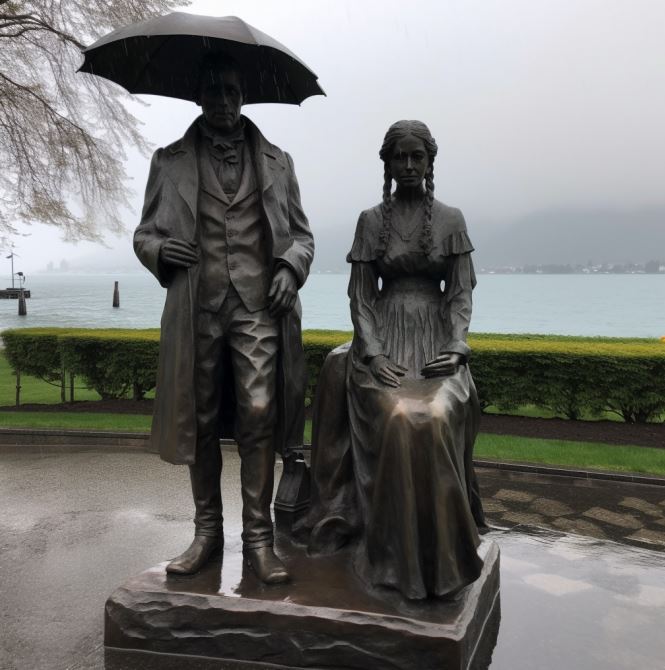
Following my recent review of two books by Jeanette Winterson, I ordered a copy of her 2019 novel Frankissstein from the library. It was serendipitous, given my current fascination with AI and background in the computer industry. Winterson’s story begins with the incubation of Mary Shelley’s novel Frankenstein on the shores of Lake Geneva in 1816 with her future husband the poet Shelley, his friend Byron, and his lover, Claire. Trapped indoors by endless rain, the nineteen-year-old Mary is inspired to write a story about a scientist who creates a new life-form. So far, so factual:
Shelley traveled through Europe in 1815, moving along the river Rhine in Germany, and stopping in Gernsheim, 11 miles away from Frankenstein Castle, where, two centuries before, an alchemist had engaged in experiments. She then journeyed to the region of Geneva, Switzerland, where much of the story takes place. Galvanism and occult ideas were topics of conversation for her companions, particularly for her lover and future husband Percy Bysshe Shelley. In 1816, Mary, Percy, and Lord Byron had a competition to see who could write the best horror story. After thinking for days, Shelley was inspired to write Frankenstein after imagining a scientist who created life and was horrified by what he had made.
This is but one theme. The story weaves details Shelley’s life – up to an including the deaths of her husband and Byron, with the Britain of the early 21st century, where Ry Shelley, a young transgender doctor falls in love with Victor Stein, a leading computer scientist championing AI and carrying out mysterious experiments in a network of tunnels beneath Manchester. Meanwhile, sleazy entrepreneur Ron Lord looks to make his fortune launching a new generation of sex dolls for lonely men.
Winterson’s genius is not just the obvious foreshadowing of AI that the early 19th century novel explored, but in the rich series of hints of the shape of things to come which, in 2019, perfectly encapsulates today’s debates about ChatGPT and other forms of AI:
She said, Machines that mimic a mind! Oh! Suppose such a thing should happen one day! Yes! Yes! Imagine, gentlemen, how it will feel if someone invents a LOOM that writes poetry….A POETICAL loom! An abacus of words. A rote poet…
p 136
But look at this! said Ada [Lovelace], lying flat on the floor and retrieving a piece of paper from underneath the contraption with castors that is to change the world. [Babbage’s Analytical Engine]
Yes! Look at this. It will amuse you…It purports to be a letter from Babbage about his latest invention: THE NEW MECHANICAL PATENT NOVEL-WRITER.
I perused the cartoon, and spoofs of testimonials from Mr Bulwer-Lytton and other famous writers:
I am now able to complete a 3-vol novel of the usual size, in the short space of 48 hours, whereas, before, at least a fortnight’s labour was requisite for that purpose…
p. 321
Poetry
As in her other novels, Winterson’s prose has wonderful poetic passages. She writes of the hopes and fears lovers feel and the fractured possibilities of other lives:
He says, Imagine us. In another world. Another time. Imagine us: I am ambitious. You are beautiful. We marry. You are ambitious, I am unstable. We live in a small town. I am neglectful. You have an affair. I am a doctor. You are a writer. I am a philosopher, you are a poet. I am your father. You run away. I am your mother. I die in childbirth. You invent me. I can’t die. You die young. We read a book about ourselves and wonder if we have ever existed. You hold out your hand. I take it in mine. You say, this is the world in little. The tiny globe of you is my sphere. I am what you know. We were together once and always. We are inseparable. We can only live apart.
p. 161
From the intensely personal to the social and political, the novel straddles the history of computing (Byron’s daughter Ada Lovelace, Charles Babbage, Alan Turning, Bletchley Park); the moral dilemma and mechanisms of sexbots; dehumanized life of the Industrial Revolution in Manchester; the Peterloo Massacre; women’s rights and lived experience, starting with Mary’s mother, Mary Wollstonecraft, and her own experience of losing newborns; and, most succinctly, the experience of being trans:
I’m trans and that means a lifetime of hormones. My life will likely be shorter, and it’s likely that I will get sicker as I get older. I keep my body maleness intact with testosterone because my body knows it wasn’t born the way I want it to be. I can change my body but I can’t change my body’s reading of my body. The paradox is that I felt in the wrong body but for my body it was the right body. What I have done calms my mind and agitates my chemistry. Few people know what it’s like to live this way.
p. 310
Future Imperfect
A protagonist who is living a paradox signifies the larger paradoxes of the past and potential futures:
Rock-star poets who abuse their partners even as they pen immortal lines.
Crass purveyors of sexbots who serve the needs of the lonely, elderly, and isolated.
AI capabilities that threaten our concept of humanity, as problematic as Shelley’s early 19th century imaginative creation.
A steampunk assessment of a future computing, limited by Victorian technology:
Imagine, said Ada, it might be possible to build the machine as a city and live inside it…
Would there be more than one machine? I said.
The scale would make it impractical to have more than one, said Ada. And, as it is steam-powered, it would require a great deal of coal.
p.325
Funny, inventive, entertaining. A great read. And, guess what, ChatGPT nails it:
While Midjourney pictures it:
/Imagine Mary Shelley and Frankenstein on the shores of Lake Geneva in the rain –v 5
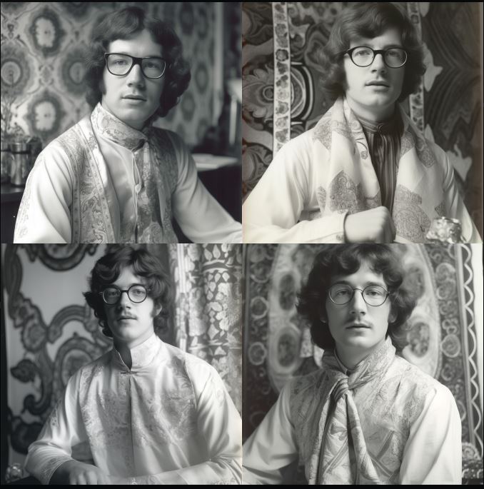
A new addition to Midjourney, the AI image generating program, is the /describe command which reverse engineers a photo into an AI prompt. Instead of text to image, you get image to text.
Here’s the results of submitting three very different headshots, with the 4 separate ‘reverse prompts’ generated.
Quiet potency
a man wearing glasses is smiling for a photo, in the style of light orange and dark green, quiet potency, anglocore, poolcore, glasgow style, mottled, rectangular fields.
an older man wearing glasses, white shirt, and green shirt to smile, in the style of lucy glendinning, multiple filter effect, john higgins, light orange and light bronze, spiritualcore, photo taken with provia, steve argyle.
a man smiling for the camera wearing glasses, in the style of light orange and dark green, ogham scripts, webcam photography, grandparentcore, crisp and clean lines, anglocore, abrasive authenticity.
a man in glasses who wears glasses and smiles, in the style of light orange and dark green, steve hillier, keos masons, photo taken with provia, grandparentcore, steve argyle, crisp and clean lines.
I quite like ‘quiet potency’, not so sure about ‘abrasive authenticity’ and in the dark why ‘keos masons‘ was listed (as with all the photographers, designers, and artist names listed I had to Google this to even know what MJ was pointing to.)
Humanist, writer
a man with glasses and jeans wearing a hat, in the style of poetcore, anglocore, grandparentcore, dark brown and indigo, photo taken with provia, quadratura, spot metering
an older man wearing glasses and a hat, in the style of steve argyle, poetcore, max magnus norman, tony conrad, dark indigo and brown, dynamic and energetic, anglocore
man in blue jeans is wearing glasses and a beanie, in the style of anglocore, realist portraiture, grandparentcore, grid, photo taken with provia, humanist, writer academia
harry carver, author of, in the style of adrian donoghue, poetcore, tony conrad, light indigo and brown, george tooker, authentic details, stockphoto.
Again, ‘dynamic and energetic’, ‘writer academic’ resonates. Why ‘quadrantura’?
In fine art, the term quadratura describes a form of illusionistic mural painting in which images of architectural features are painted onto walls or ceilings so that they seem to extend the real architecture of the room into an imaginary space beyond the confines of the actual wall or ceiling. Although the term can apply to the illusionistic “opening up” of walls, it is mainly associated with Italian church fresco painting, notably that of the Baroque era.
Zen
an old black and white photograph showing a young man with glasses, in the style of 1970s, flowing fabrics, feminist perspective, terracotta, cloisonnism, softly organic, uniformly staged images
a man with glasses at a sink, in the style of pegi nicol macleod, queer academia, 1970s, alma woodsey thomas, studio portrait, zen buddhism influence, esther rolick
a man in glasses sits on the floor with a towel at his feet, in the style of 1970s, bengal school of art, extremely gendered, women designers, bibliographic anomalies, silver, uniformly staged images
man has his glasses on looking off into the distance, in the style of 1970s, queer academia, dorothy johnstone, photo taken with provia, bengal school of art, alma woodsey thomas
Spot on with ‘the style of the 1970s’ and I like ‘zen buddhism’. Not sure where the ‘towel at his feet’ came from.
Reverse prompts
These reverse prompts can, needless to say, then be fed back into Midjourney to create new images. These are all from the first prompt generated above, in the order shown, with just the text.
Click to enlarge
Feedback loop
Inserting the original picture into the prompt THEN adding the first block of text produces varied results, closer to the original.
Thanks to Monu Sohal over on Facebook, here’s an amusing illustration of ChatGPT’s output. It takes Fleishman-Kincaid to a whole new level! Why do *you* think it rains?
Pretend to be a person with an IQ of 200. Why does it rain?
Rain occurs as a result of the atmosphere’s ability to hold moisture. When the air becomes saturated with water vapor, it rises and cools, leading to the condensation of water droplets, which form clouds. When the clouds become sufficiently dense and heavy, the water droplets combine and fall to the ground as precipitation, in the form of rain. This process is known as the water cycle and is an integral part of Earth’s climate system.
Pretend to be a person with an IQ of 100. Why does it rain?
Rain happens because the clouds get too full of water and then it falls down to the ground. That’s what we call rain.
NOTE: I got dramatically different answers to the lower IQ prompt that Monu showed in his original posts. Not sure if ChatGPT ‘evolved’ since he ran them, or he edited them for effect after they were generated.
A sister program from OpenAI to ChatGPT which I’ve experimented with is Dall-E2. This does for images what the other program does for text. In response to prompts, it creates realistic images and art. Just as knowledge workers should find out about ChatGPT before it finds them, so graphic designers and illustrators should check out Dall-E2.
I experimented with Ulysses, supplying snippets of the poetic text that stood out for me when I read the novel. Here’s some of the results.
**UPDATE: I ran the same prompts through Midjourney and added the results below. Some are the original 4x results, others were upscaled. I also ran the prompts through Stable Diffusion. It presented 4x results horizontally, and I chose the most appealing.
Dalle2: “Old wall where sudden lizards flash.” (Scylla and Charybdis, p. 194)
Midjourney: “Old wall where sudden lizards flash.”
Stable Diffusion: “Old wall where sudden lizards flash.”
Dalle2: “Where fallen archangels flung the stars of their brows.” (Wandering Rocks, p. 232)
Midjourney (4x): “Where fallen archangels flung the stars of their brows.”
Stable Diffusion: Where fallen archangels flung the stars of their brows.”
Dalle2: “…stars hung with humid nightblue fruit.” (Ithaca, p. 651)
Midjourney (4x): “…stars hung with humid nightblue fruit.”
Stable Diffusion: “…stars hung with humid nightblue fruit.”
Dalle2: “…the extreme boundary of space…” (Ithaca, p. 680)
Midjourney (4x): “…the extreme boundary of space…”
Stable Diffusion: “…the extreme boundary of space…”
Dalle2: “…past beds of reeds, over slime, mudchoked bottles, carrion dogs.” (Hades, p. 95)
Midjourney: “…past beds of reeds, over slime, mudchoked bottles, carrion dogs.”
Stable Diffusion: “…past beds of reeds, over slime, mudchoked bottles, carrion dogs.”